7 Designer Tips for the Best Paint Color Combinations to Refresh Your Home
Choosing the right paint colors for historic homes can completely transform the look and feel of the space. The goal is to keep the classic charm while adding a fresh, modern touch. A smart color palette can highlight beautiful original details and still make the home feel updated and inviting.
To help you get it right, we asked seven top interior designers to share their favorite paint color combinations. These expert-approved choices come from real projects that blend old-world elegance with modern style—perfect for anyone looking to refresh a historic home and increase its value.
1. Deep Navy and Warm Marble for Modern Flair
“When updating a historic home, choosing the right paint colors is key to keeping its charm while adding modern style,” says Kristin Hintlian, Owner of Bonsai Kitchen, Bath & Flooring. “In one Victorian-style kitchen remodel, we used deep navy blue cabinets with warm marble countertops. This added a fresh look without losing the home’s traditional character.
Another project involved a Colonial home where we kept the original hardwood floors and paired them with soft dove gray paint on the walls and cabinetry. The result was a bright, modern feel that still respected the home’s historic roots.
These experiences taught me that great home remodeling balances bold, updated ideas with colors and finishes that honor the past. The right combination of classic and modern paint colors can increase both the beauty and value of any historic home.”
2. Combining Classic and Modern Tones
“The right mix of paint colors can keep the beauty of a historic home while giving it a fresh, updated look,” says Matthew O’Grady, Director at Thomas Matthew Kitchens & Furniture. “One of the best techniques I’ve learned is blending rich, classic tones with soft modern shades. This highlights original details while keeping the space light, open, and welcoming.
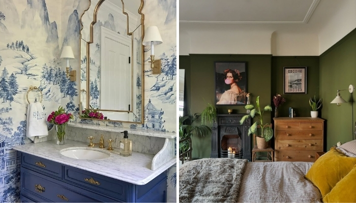
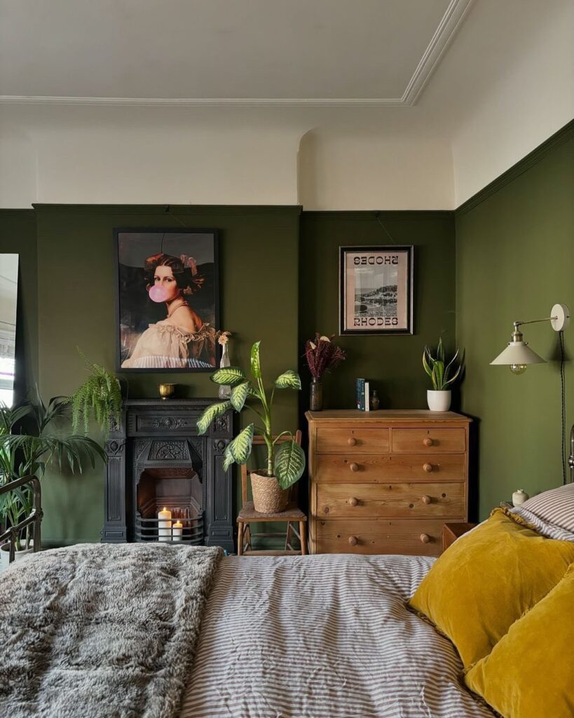
In a recent home renovation, we worked on a 1920s Craftsman-style house with beautiful woodwork that felt dark and outdated due to old wallpaper and deep brown walls. We used Benjamin Moore’s Hale Navy for bold contrast, Sherwin-Williams Alabaster for a soft white balance, and Farrow & Ball’s Lichen—a sage green—for accents. These colors tied in the natural surroundings and honored the home’s character while making it feel bright and current.
This thoughtful color combination respected the home’s history and gave it a timeless, modern appeal—perfect for increasing comfort and boosting real estate value.”
3. Balancing Historical Charm with Contemporary Colors
“At Accountable Home Services, I’ve found that the key to updating historic homes is using color strategically to blend old charm with modern style,” says Mike Martinez, Owner. “One standout project involved an Edwardian-era home where our goal was to refresh the look while keeping its original character.
We chose earthy tones—sage green and muted mustard—to highlight the home’s vintage woodwork while adding a clean, modern feel. To stay eco-friendly, we used Benjamin Moore Natura paint, which offered both quality and sustainability. The sage green brought out the detailed craftsmanship, and the mustard added a lively yet respectful pop of color.
This thoughtful mix preserved the home’s historic beauty while making it more appealing to today’s homeowners. What I’ve learned is that the right interior paint palette can completely transform a space—keeping its roots intact while boosting real estate value and modern appeal.”
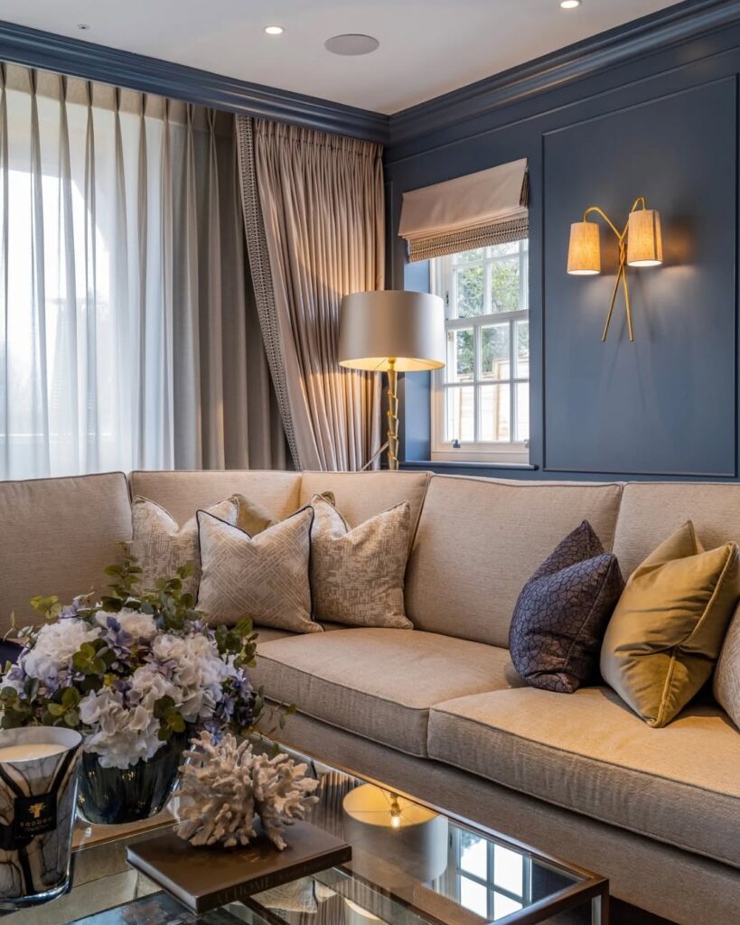
4. Neutral Base with Deep Accents
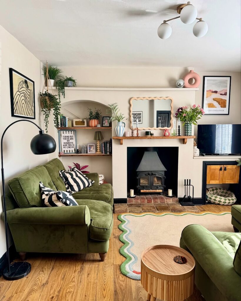
“In my work at Marquet Media, I’ve discovered that starting with a warm neutral like Benjamin Moore Swiss Coffee creates the perfect base for blending historic charm with modern style,” says Kristin Marquet, Founder and Creative Director. “I often pair it with bold accent colors like charcoal or navy blue to bring out original architectural features. Adding touches of antique brass or crisp white helps keep the look clean, bright, and updated.
In a recent home makeover, we used Swiss Coffee on the walls to create a cozy, timeless atmosphere. The intricate woodwork and moldings in the living room really stood out. For the entryway and dining room, we added navy blue accents that gave the space depth and a touch of modern elegance. The result? A home that still felt historic—but fresh, open, and totally relevant.
The biggest lesson: a soft neutral base with carefully chosen accent colors can highlight a home’s heritage while boosting its real estate appeal and livability.”
5. Navy, Ivory, and Brass for Spanish Style
“Believe it or not, deep navy paired with soft ivory and warm brass accents is one of the best color combinations for refreshing a historic home without losing its charm,” says Danny Niemela, Vice President & CFO of ArDan Construction. “We used this palette in a 1920s Spanish-style home in Phoenix. The space had stunning original features—dark wood ceiling beams and detailed tilework. Navy cabinetry and trim added richness, while ivory walls kept the rooms bright and airy. Brass fixtures brought warmth and tied everything together, blending perfectly with the home’s historic character.
The key was to enhance the original architecture, not compete with it. In fact, we kept over 60% of the home’s finishes untouched. This allowed the new colors to complement the vintage elements rather than overpower them.
The biggest takeaway? Balance is everything in a historic home renovation. A modern color scheme should highlight the craftsmanship, not erase it. When done right, a thoughtful blend of old and new makes a home feel refined, timeless, and ready for modern living—while still boosting real estate value.”
6. Heritage Green and Gold for Staircase
“Our home’s staircase, originally built in the 1880s, had beautiful woodwork hidden under layers of old paint,” says Daniel Vasilevski, Director & Owner of Bright Force Electrical. “Once we stripped it down, we uncovered rich hardwood with detailed craftsmanship that deserved to shine. We needed a color palette that respected the home’s Victorian heritage while still feeling fresh and modern.
After testing different combinations, the perfect match was deep heritage green, warm cream, and soft gold accents. The green added a bold, timeless look, the cream brightened the space, and the gold details added just the right touch of elegance and warmth.
This color scheme worked beautifully because it enhanced the original woodwork without making it feel outdated. The heritage green fit perfectly with the home’s historic roots, the cream softened the look, and the gold trim reflected light and highlighted the grain in the wood. In the end, the stairs became a true centerpiece—both classic and updated in all the right ways.”
7. Mixing Original and Contemporary Flooring
“In a recent restoration of a 100-year-old home, we kept the original hardwood flooring in the entryway and installed wide-plank white oak in the surrounding rooms,” says Dan Grigin, Founder & General Manager of Elephant Floors. “This mix created a smooth visual transition from historic to modern spaces, respecting the home’s original charm while adding a clean, updated look.
We refinished the old wood in a warm honey tone, which paired beautifully with the contemporary white oak. The tones worked together to blend traditional character with modern interior design trends.
This strategy allowed us to preserve the home’s architectural heritage while introducing fresh, functional flooring—perfect for homeowners who want a stylish update without losing historical value.”
Q: How can I choose colors that feel fresh but still honor my home’s historic character?
A: The key to choosing paint colors for a historic home is to blend traditional shades with modern accents. Begin with historically accurate base colors—such as muted sage green, ochre, or deep navy blue—that match your home’s original style. Then, add lighter, contemporary tones like soft white, warm cream, or pale gray to brighten the space. This approach helps preserve the home’s character while making it feel fresh, comfortable, and livable for today’s lifestyle.
Q: Are there specific color palettes that suit certain historic architectural styles?
A: Yes, different historic home styles have ideal color palettes. For example, Victorian homes often look best with rich jewel tones like burgundy, emerald, or navy, paired with dark wood finishes. In contrast, Colonial-style homes typically suit earthy tones and soft pastels such as muted blues, sage greens, or creamy beige. To get the best results, research your home’s architectural era or consult with a historic preservation expert who can recommend authentic and stylish color combinations that respect the original design.
Q: Can I use bold or trendy colors in a historic home?
A: Absolutely—bold or trendy colors can work beautifully in historic homes when used with care. Try using them as accents in modern furniture, artwork, textiles, or a single feature wall. When these vibrant tones are balanced with traditional colors in elements like trim, molding, or original woodwork, they can revitalize the space without overpowering its historic charm. This approach helps create a stylish, balanced interior that feels both fresh and respectful of the home’s character.
Q: What’s the best way to modernize a historic space with paint?
A: Start with a classic neutral base—like cream, soft gray, or warm white—on walls and ceilings. These colors create a clean, timeless backdrop. Then, add subtle color through trim, cabinetry, or textiles to bring in personality without overwhelming the space. This method allows you to modernize the interior while letting the home’s original architectural details stand out.
Q: How do I test if a new color works in a historic interior?
A: The best way to test paint colors in a historic home is to apply samples on large poster boards and move them around the room during different times of the day. This helps you see how natural light affects each shade. Be sure to compare the samples against original features like wood trim, molding, or tile to make sure the new color complements rather than clashes. This step is crucial for achieving a balanced, cohesive look that respects your home’s character.