Ridiculous Design Fails That Will Leave You Scratching Your Head
This Commemorative Gift Design Didn’t Go Exactly as Planned
I guess its the thought that counts, huh? Well, we’re pretty sure that was the thought this boyfriend had when this badge came back from the manufacturer. He commissioned it as a gift for the pair when he got engaged to them. Except that it is a little bit… different. But to be honest, this isn’t really his fault. The person who made the badge didn’t even bother to come up with a decent representation of the boyfriend’s right hand on it.
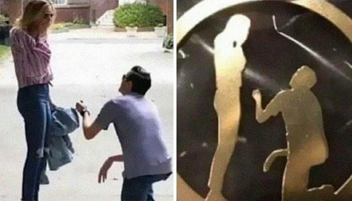
There’s no fingers or anything to give someone a hint a hand is present. You also see no wrist as if everything else is only hanging.
“The Virgin Mary: A Symbol of Welcome and Inclusivity”
We’ve seen many Virgin Mary statues, but nothing like this. This statue was probably intended to be slightly more interesting, and the sculptor met his or her goal with this one. If you were not aware of what this knee was before seeing it, so you’d probably think it is a dedication to an entire different thing. That said — it has a janky charm to it.

And really, it kind of looks like a lot of the older images and statues of the Virgin Mary that tended to emphasize the fertility and the, uh, virgin part of her name more than the other.
“Art” Space With A Capital “F”
I guess whoever made this sign didn’t think it through completely when they decided to place a large “F” right in front of the word art. Instead, it ended up spelling ‘Fart space’, which we’re sure this room doesn’t stand for. Still, it does raise the question of why there’s an “F” there to begin with. Perhaps the building designation itself, but why not just say that on a different sign instead?

Either way, we’re pretty sure that whoever was tasked with making this sign had a good chuckle when handed this job. It’s a little bit hard to believe they never mentioned this so they could get it fixed.
“Think Twice, Santa—It’s Just Not Worth It!”
This one also came from good intention, like many of the design fails on this list. All this city wanted to do, was to attempt to brighten up a few souls by putting some Christmas decorations up around the town. At any rate, he/she/whatever is probably parked that Santa in the worst spot. Looks like Santa got into some argument with Mrs. Clause and said fuck it all; Dare say someone rang the fire brigade to talk him down from there.

But maybe it wouldn’t be quite so bad if not for the ironic text underneath that says “jump for joy.” Here’s one that you’d think the installers of the sign would have caught.
“When You Cut Costs by Skimping on Hiring an Extra Actor”
So frequently, we overlook the additional work advertisements use to work with numerous secondary players, who are typically unpaid or poorly spent for their craft. But this is what transpires when a company cannot even go through the effort of hiring some male and female actors. They literally just slapped some woman’s hair on the first guy’s face and expected no one would come to the conclusion that they ran outta money and just photoshopped a wig onto his face.

The worst part is this looks like a casino pamphlet so you know they had a few extra dollars they could’ve spent on just hiring a woman.
Just How Nature Intended
We sincerely hope this is not the case but it looks like the town or city that this photo was taken in chopped down these trees and made space to put panels for shade. Frankly, we can’t see any city planner literally lopping the tops off trees to enable the construction of something as ugly as these panels, but you never know. It all has the appearance of having been constructed in the immediate aftermath of the trees being felled.

On the other hand, though, these trees could have been ruining the foundation of the building or they could have been dead or dying from some sort of disease.
Always Ready To Rock
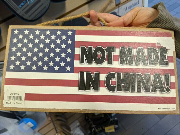
It’s a crowded field with numerous products touting “made in the U.S.A.” and many of them are, in fact, just that. But every now and again you see something like this. A giant not made in china on an American flag sign is front and center But that isn’t what the bottom left corner bar code is saying. Quite the contrary in fact.
Finally, there should be an additional red stripe at the very bottom of all of that. Well, the factory workers in China who made this probably had a good chuckle over that.
“What Constitutes False Advertising?”
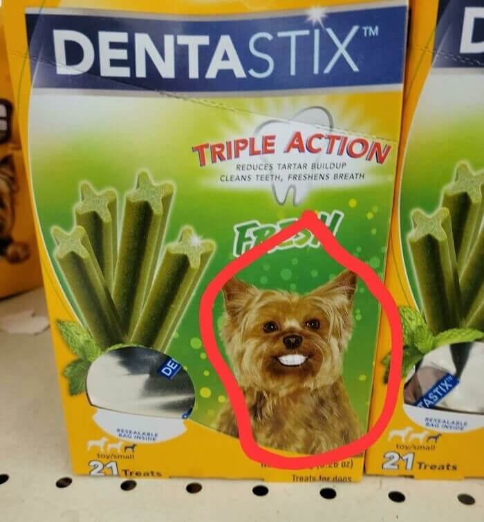
For those not in the know, Dentastix is a dental chew for dogs. The concept being that the corners of the sticks will sweep plaque away. But the dog on their packaging will have you convinced that it’s human teeth and human gums are going to fully form in your dog once they chew a few sticks at home.
It is actually somewhat creepy to see a dog smiling human style. Dont we love our pups tho; gotta admit that they got goofy grins. Or perhaps Dentastix is simply just looking for a low-hanging piece of humor, right?
“Who Knew Dogs Could Look So Scary When They Smile?”
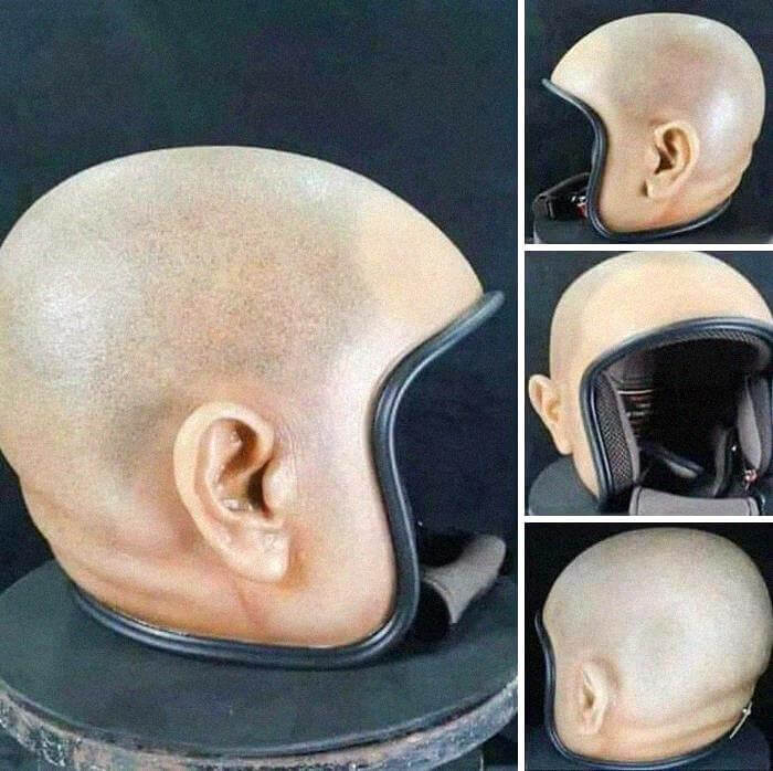
This one we’re not quite sure if it’s a fail, but someone came up with and manufactured a motorcycle helmet that looks like a human head. Well, if it works, maybe it is not a fail? We guess. But we’re pretty sure that will give your state trooper the heebie- jeebies, and we’re pretty sure that wearing one of these out on the highway would land you in the slammer for not having on a helmet.
If you slammed your dome into the cement, you could also lose a couple of chompers. You do not want EMTs involved trying to ascertain which ear is real and which is which in a sticky situations.
“A Helmet Designed to Look Like a Human Head”
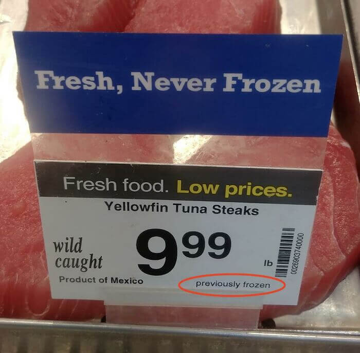
We’re pretty confident that the average Jill and Joe out there has seen signs pledging “fresh, never frozen,” but how true is that? Okay, so that’s probably not the case at all. Well, duh, because you kind of want a wide array of different nasty-ass meats to be frozen at some point, or else you’re gonna get some sort of disease. The same goes for fish — not ideal if you have to move it a long way.
Worst case, it’s just dishonest, best case a weird decision – to have a sign that says that fish wasn’t frozen, then fine print saying it was.
Only Kind Of Frozen
This is quite comical, chiefly because for my money this comes from Thompson Reuters, one of the largest, most trusted, world news services. I imagine somebody was giving a presentation somewhere, the PowerPoint went haywire. The bubble on the left displays the list of values but they do not look like they intersect with the company values on the right. If the circles don’t overlap it would not be that bad (like a Venn diagram)
It’s also a reasonably safe bet that the person who usually produces graphics for Reuters was absent that day or something, and a graphic designer was forced to reference Wikipedia on the fly in order to make this without outside assistance.
“These Are Great, but Let Us Share Our Core Values”
Everyone has a bad day. This graphic designer was likely cranking out artwork for other pages and had little time to thoroughly review this image for the weather page. Or at least we hope so as missing this is hard to imagine. We understand what they were aiming for, but with the sun’s hand on it like that, the thermometer looks like something else entirely.

Someone at USA Today should have noticed this problem before it went out, as with much of the other design fails here. That is usually the job of the art director or an editor.
So Hot It’s About To Blow
The competition with regards to phone manufacturers is extremely cutthroat. Not convince, well do take a look at this image then. All jokes aside, the person that designed this would have never thought their work would end up looking like this hanging (pun not intended), But likely, it didn’t take a good long time for pedestrians to look up and see that this was a bit of an odd advertisement.

USA Today should have caught this before it went out, just like they should have caught most of the other design mistakes here. People like an art director or an editor are generally in charge of that.
It’s A Tough Market Out There
There is a lot of fierce competition among phone makers. Take a look at this picture if you don’t believe us. No matter how funny the jokes are, the person who created this probably had no idea that it would look this way when the sign was put up. Some people on the street probably didn’t have to look up for long to notice that something wasn’t quite right about this ad.
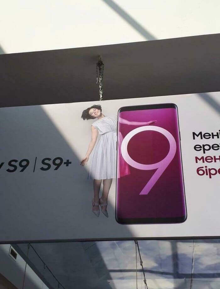
Everything seems to fit together too well. The woman’s happy face doesn’t help either, which is strange because you’d think it would.
“These Dog Bone Paperclips Are Serving a Dual Purpose”
That being said, this might not even be a design flaw. In this picture, the dog bone paperclips can be used as both dog bones and other bones. In fact, it’s hard for us to think that this wasn’t done on purpose. Also, you could just clip them with the middle part behind the paper, which is how most paper clips are meant to be used. It would still look like a dog bone.
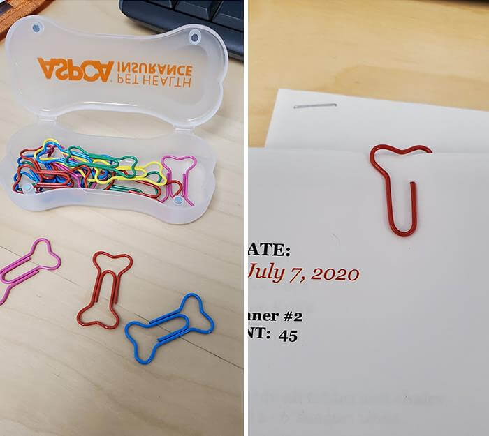
I guess it didn’t take many people long to realise that these looked like certain bodyparts, because if you do a quick search for one now, you can find a couple of different gag gifts all based on this design.
One Size Does Not Fit All
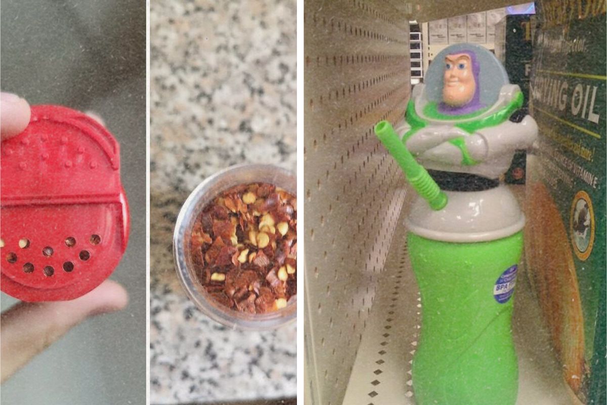
This would actually piss you right off. This person unscrewed the lid of a chili flake container, only to realize the holes in the lid were too small for real chili flakes to get through. I mean, sure they could just drill their own holes or unwire the whole top and sprinkle that way, but it just feels like the company would have figured this out prior to putting it on a shelf. Most likely the same types of caps as the entire line.
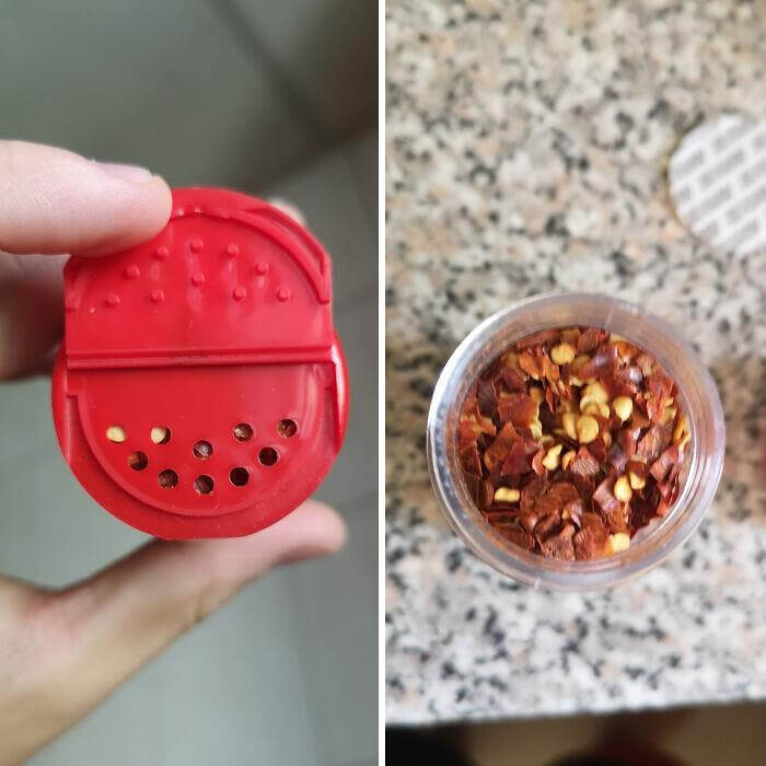
Oddly enough, occasionally you will discover bay leaves inside containers with caps such as this. As in whole bay leaves, which should be used whole, or at the very least in halves.
“Despite Inflation, the Cost of Raising Kids Continues to Decrease”
We don’t know where this sign was found, but we wish we did. Kids Eat Free should Read kids eat free. The designer for whatever reason inserted kids smack dab in the center of the phrase and even though he tried to offset it with a separate color it looks wonky. But at least it’s nice to see at least some things are getting less expensive as everything else seems to be going up.
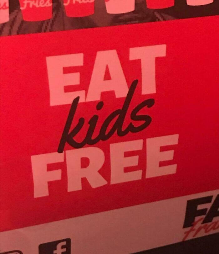
Of course, baby back ribs were much costlier a couple of years ago, so if this is just about running a restaurant without a profit, we do wonder how people survive with prices like these — (Okay, we’ll stop now).
Looks Pretty Appetizing
If you’re wondering to yourself (and we weren’t sure at first either) this would be ice cream. Or did a devil, or at least ice cream man-type devil. Instead, it appears like an at-home MacGyver who never before in their life saw ice cream banged this out after a few quick Google-searches. It’s a little terrifying and we sort of hate it and sort of love it. Is there a word for that?
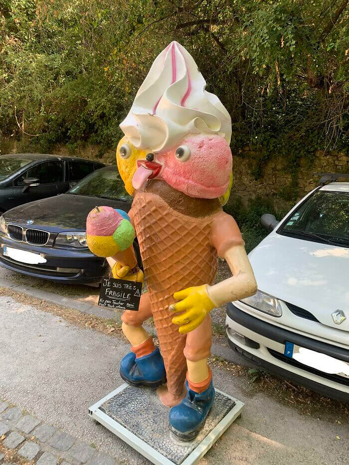
Also, it appears that there is something dripping, which would mean it will evaporate at some point. And now we sort of feel guilty about it.
“They Knew Exactly What They Were Doing with ‘Tit’s Pizza'”
Whoever made this sign, or designed it, knew exactly what they were doing, and don’t try to tell us otherwise. Something about a pizza as an “O” is just not clicking with our brains, and we just cannot trick our brains into thinking that this works for whatever reason. The picture was taken randomly whilst driving by and posting it to Facebook where the road sign occupies the bottom half of the sign.
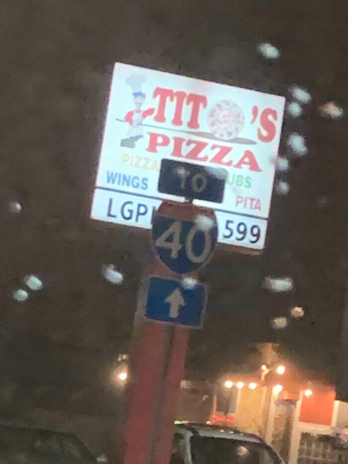
Then, they added that they accidentally said “Tit’s Pizza” and that their mom was not that impressed. Can’t say we really blame them though, there’s just something about the sign that makes it feel like you have to say it.
A Set Of Trick Stairs
Because, you know, getting up and down stairs is not difficult or dangerous enough. So enter this your precious staircase, wherever it is. Weirdly there is an elevated step before you step on, or off, which seemed like an extremely bad design idea to the designer. The design philosophy or point behind this is somewhat unclear to us but it may or may not be some sort of anti-flood measure?
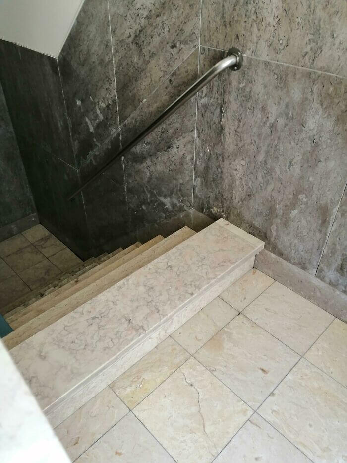
Inde, however, we are sure endless humans have stumbled over these things and virtually destroyed their faces, so it’s a threat/reward concerned with elements like this.
“Tips for Delivering Bad News Effectively”
This one looks bad, but it’s not bad enough to not be right. The postcard reads, “Congratulations, you have cancer.” But it is talking about the zodiac sign, not the medical condition. It’s all tracks, considering that Cancer is technically a crab. That said, certainly there was a more proper way to express or display that information. A well-placed few stars or other signs could have made a better distinction of the two cancers by the designer.
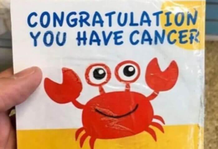
At the moment it just makes you wonder why someone gave you a card, with a super jolly crab on it, in order to celebrate your cancer, which yeah—dark.
To Infinity And Beyond
When it comes to kid’s toys, we’ve seen some pretty shoddy designs. But maybe none more, um inappropriate than this Buzz Lightyear cup. Which boils down to one critical design choice. Look, for some reason someone decided it would be a good idea to locate the straw where Buzz’s pelvis would be. Was it intended to make users cringe every time they raised the cup to their mouth?
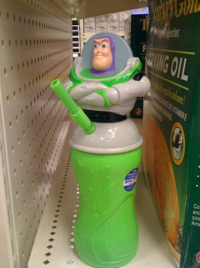
This may also have aided if he wasn’t crossing his arms in the manner where he folded them! He just looks super smug, especially with the look of the smile. This design isn’t working, period.
Right On The Edge
We almost pity this model, whoever she may be. Imagine she had no idea that this was how her image was going to be used. It is also a bit odd that they decided to put it on the edge of this building because the only way this will ever not look super weird is if you are looking at it from far away. Still, it’ll probably look all wonky at that time.

Then again, they could have just not had a better place on the building for something this big. But a fully driven model begs the question — why model cleanly at all?
“Perfectly Timed for the Fourth of July Celebration”
Introducing The Next Level Designer Sunglasses Just kidding, we hope — but it may very well be real life. These do not appear at all practical. We sort of understand the thought process behind creating a pair of U.S.-shaped sunglasses, but they really just don’t wear well at all. Her left eye is home default without the glasses in the product pictures, as Canada is west of Michigan.
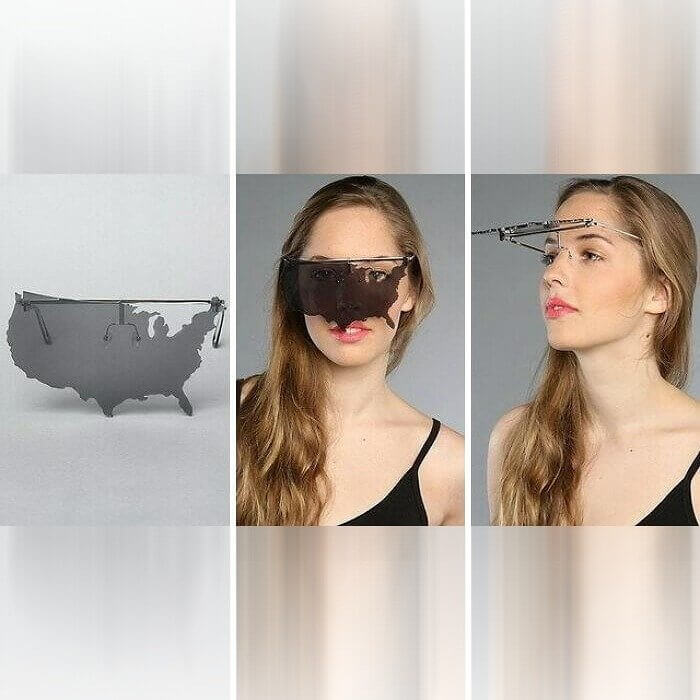
Plus is a little funny that Hawaii and Alaska are not included. Perhaps they could do some coordinating studs or something else to match with these?
“The Ideal Bathroom Layout Is a Myth…”
Well, what can I say, a bathroom is seldom space for comfort unless you are lucky enough to have a massive 2+ bed home with a huge property! The kind of layout this is –> Some designer or architect out there really thought it was a good idea to put a single toilet between two sinks. And I’ll give credit where credit is due; it was risky. Not exactly a design fail, but weird to look at.
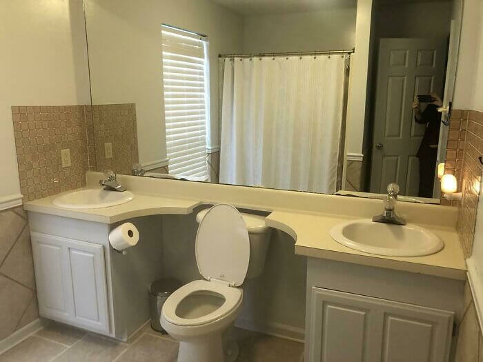
Based on the sink reflection in the mirror, it also seems like that was the only space available to fit a toilet in. And yet, they could easily have simply eliminated one of the sinks if they really wanted to.
A Little Space Here Please
Occasionally an idea appears solid in your head but it surely simply does not work out when it comes to life. This design on this vans looks like one of those cases. We get what they were trying to do, but it simply isn’t landing. They were attempting to depict the motions of a person bowling, or at least they seemed to be bowling in this image, but instead the entire thing looks like… something else.
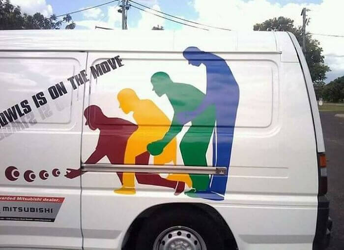
At least, the whole idea behind a sign or a commercial advertisement is to shine and describe something noticeable. We imagine this design is quite good at doing that.
An Open Floor Design
This photo right here was posted with the following story: Look at the one on the left: apparently the first thing you see when entering this house. Same goes for the other bathroom photo on this list, that’s a really big statement. But not in a good way. I shuddered at the thought of going into the house and finding someone right there on the toilet. There is not even a curtain up or anything.
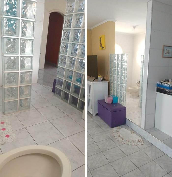
However, that’s not the sole design mistake here. One of those steps entering the bathroom is going to trip some folks up, especially if they’re headed to the bathroom at night.
This Clock Has A Lot Going On
It’s almost like this clock made up a whole bunch of different things to try and be, and none of it makes sense. For starters, it features Arabic and Roman numerals. Why? We aren’t too sure. This has just been posted and someone said its her work clock. We have no backstory (which we’d bet would be a pretty fun read). Second, the Roman numeral for 4 is IIII and not IV — and there is a quite nifty story behind that.
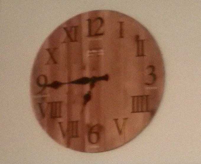
Some theories argue the Romans never actually wrote 4 as IV because of how close this version sounded to the name of Jupiter, so they never wanted to take the Lord’s name in vain. But there are theories that suggest that Romans did not use IIII with the argument that Roman numeral subtraction was a medieval invention.
Never Leave Your Couch Again
Another design that scratches genius and fail at the same time. So, this is what happens when somebody finally got the idea of merging a toilet with a couch. Throw a T.V. and cooler in there, and you might never have to leave your favorite chair again. Sure, this isn’t exactly suited for those sharing space with others. And that’s why we suspect not too many of these actually sold.
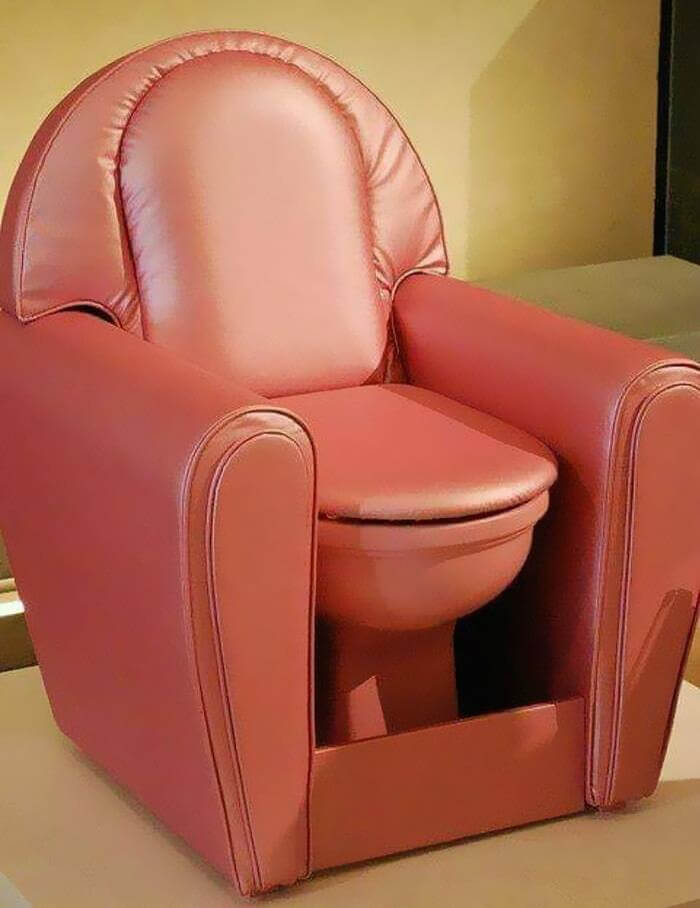
However, you have to hand it to the designer who heard “look at that ugly design” over and over again for years and said: you know what, let’s not base it on anything that will probably sell.
“It’s Like Taking a Shower in the Sink”
We’re also fairly certain the builders of this house didn’t include this shower fixture. In all likelihood, the owner replaced it afterwards with a faucet. We’re still confident they’re not having nearly as good of a time in the shower as they would if they had an actual showerhead up there. Like I said, right now you are just under a waterfall for an hour trying to wash yourself.
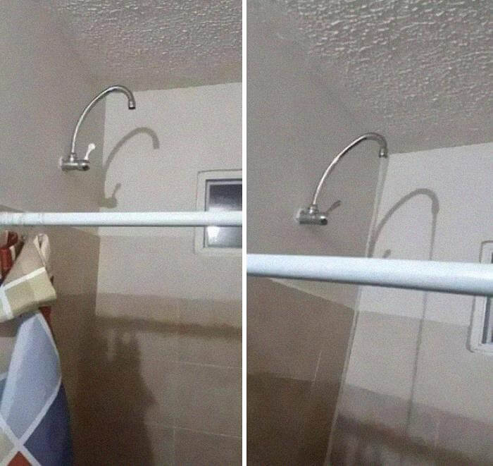
But it does work — just would have taken a little longer. And just picture yourself taking a hot ass shower under this thing. The water would likely have been warmer than it would be coming out of a conventional showerhead.
When You Really Need An Outlet
Check it, someone is going to get a medal for this. Perhaps the wall blocking the outlet was a later addition, which could explain what appears to be an awful design right next to it. But still, somebody looked at it and thought, why not just put the wall, like, in the middle of it anyway. They even had to notch the trim to fit over the outlet.
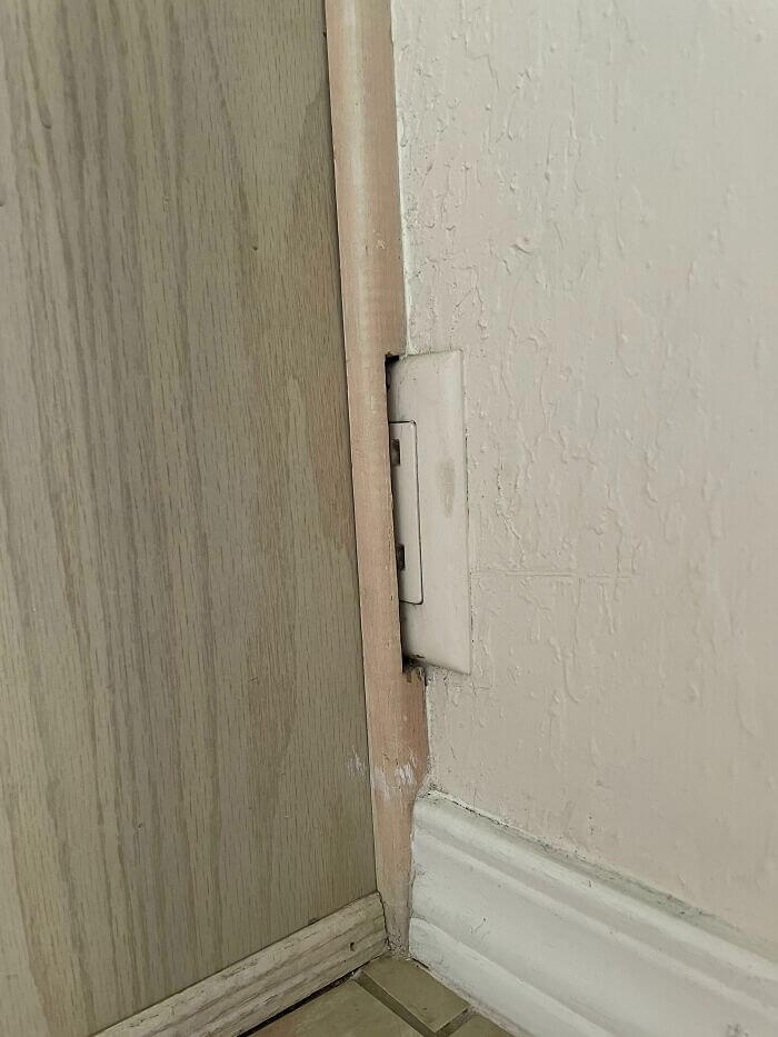
Strangely enough, you can purchase similar random wall covers at any local big box retailer that sells electric outlet covers. It would still look ridiculous, but at least it wouldn’t look utterly insane.
“Improve Your Skills or Prepare to Replace Your Windows”
When it comes to installing a home hoop, it can be difficult to find a space to put up a basketball goal. Anytime the ball enters the original space there are going to be some type of threats which the sphere is definitely going to destruction an area of the theme. But whoever put the goal up in this picture really should have looked a bit more before they did. Not even a backboard here, unless you consider the glass windows to be a backboard.
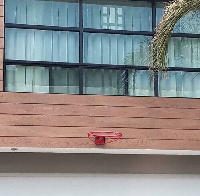
If people are using this on the daily, then without a doubt a few windows will shatter eventually. Perhaps whoever is shooting can use that as motivation to get better
A Toilet With A Decent View
This one really comes down to what you consider a design failure. There is the bathroom, or a watchtower for the toilet at least, on the roof, looking over whatever the hell on the other side. Well, clearly there were some buildings there because someone took this picture. Though we’re willing to bet that’s a fine vantage point, too. Yet, you would think this is something that a homeowner would have an architect address. Not what you normally see when a building has the toilet on the roof no?
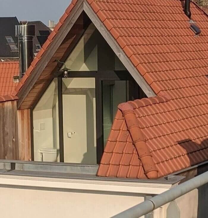
There seems to be a small balcony right outside the bathroom, so you can step out from a shower and bask in the sun or something.
“To Enter or Not to Enter: That Is the Question”
Saw this sign in Burger King. And the sign can hold several meanings depending on how you read it. Read left to right, top to bottom — it just reads: no exit, entry only. That seems easy enough. Yet if you were to read it from top to bottom first (as the spacing implies) it reads, “no entry exit only. Which is why it is easy to see how someone could get confused.
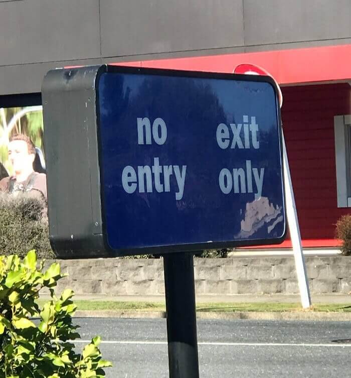
It is, at the same time, a sign to enter and a sign to exit. Whoever was designing this likely was short on space, but still. It could be clearer.
Name Brand Cuucis
First of all we all know these are knockoffs, but we can still blame the designer. They are meant to look like Gucci shoes, But whoever came up with them, misspelled the real brand and instead of writing Gucci, wrote Cuuci, which is not an actual brand and certainly sounds not the same as Gucci. He they can sound kooky or like this other word that, well, unless all our readers are currently three years old or less, have already silently uttered in their heads at least half a dozen times.
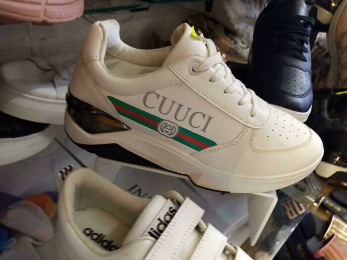
All of that blame falls on whoever fucking made these knockoffs. They’re fakes, sure, but you still want them to look as much like the real deal as possible and that includes the text, too.
“Without a Doubt: Fully Charged and Ready to Go”
No idea what is going on in this photo either. And one of the reasons why is You see that the information in the charge amount it says 100% but the bar really looks like like around probably around 75 or 60%. Then again, we might be totally off-base, and that bar is for something totally different. But then again, that is bad design, the Great Uncertainty is just too good at playing guessing games. A phone maker would have that down by now, you’d think.

Here is another option here as well. Or the state of all of us is indeed 200%, but the truth in this photo is 100% accurate. That would be the only logical explanation.
Collab Or Knockoff
At least, that may sound surprising because this is a real collaboration with North Face and Gucci. Unlike some of the other shady items of clothing on this list, this isn’t actually a knockoff. But we literally had to Google the fact that this was a collab with the songstress and when people are doing that, maybe you’re gonna want to switch the design up a bit, especially since it’s a collaboration.
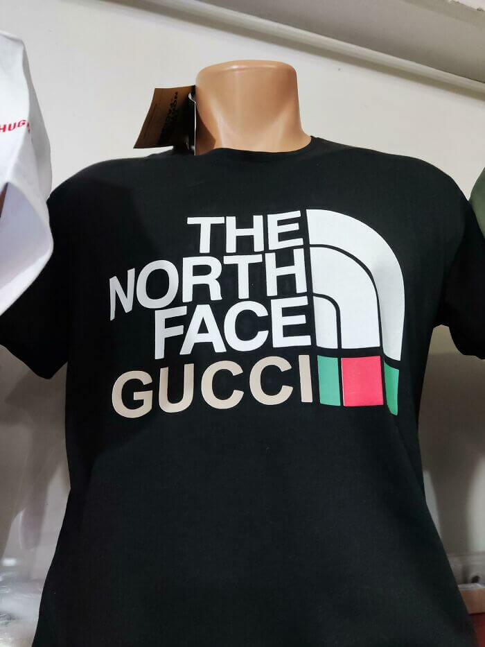
In fact these two literally just slapped one of their names under another and changed some colors and called it a collaboration. We had thought that collaborations were supposed to mix styles and result in new and exciting designs.
“Pikachu Has Definitely Seen Better Days”
Here, someone shared photo on the Internet, and messaging that Pikachu doll was poorly designed. We don’t quite think so. The design is a little rough, and he doesn’t fully resemble the character that we all know, but it could be much worse than a few of the other designs on this list. With that being said, though, it does look really spooky, but then again don’t most dolls loke a little bit spooky, right?

This one only looks especially creepy because it’s a plush toy version of a pretend monster. All he needs is an e-collar so you keep this guy of whatever munched his face away from him and you are right good.
A Wiper With No Window
You gotta be ready for anything, right? That’s not quite the case here, though, and this van certainly could’ve lived without a rear window wiper. There isn’t actually a window to clean, since it looks like they just had it wrapped. The funny part: It appears a driver had just attempted to clean the rear windows, as evidenced by the cleared area atop the back windshield. This was also taken at least twenty-five years after a forest fire in the area.
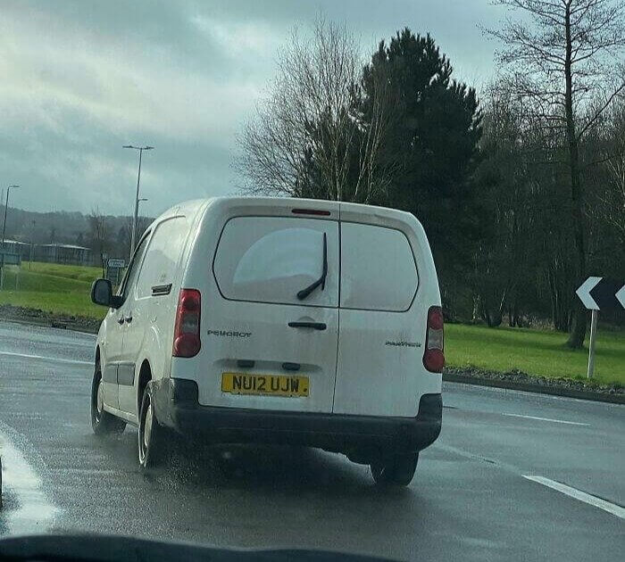
At least this one was not completely the fault of the designer. It’s to the one that had the back window wrapped and who left the wiper there. Though, it was probably not worth the effort to pry it off.
“Welcome HNME… or Is It HNIVE?”
This adorable little home decor sign is meant to say Home. We don’t exactly know how it all reads and what it reads, however. It kind of looks like the way your spelling words like “HNME” and “HNIVE,” or whatever depending on how you feel. the lil castle kinda sorta looks like a house on fire too, not the best sight for sore eyes after work, you guys.
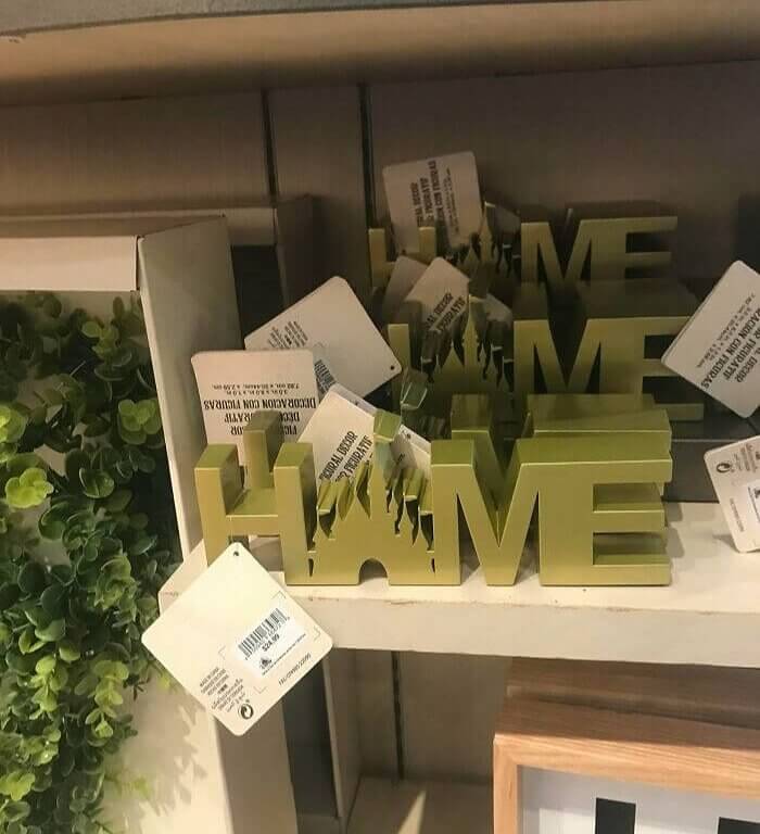
Either way, it absolutely does not resemble its intended form—and that’s just one reason it’s a design fail. Apologies Disney castle, or Red Square, or whatever you are.


